
Sutro Consumer Mobile App Redesign
Redesigning the entire Sutro consumer mobile app experience, allowing users to manage multiple pools and homes under one modern, intuitive dashboard.

BACKGROUND | RESEARCH | DESIGN | PROTOTYPE | VALIDATION | NEXT STEPS
MY ROLE
UX Researcher, UX/UI Designer
TIMELINE
Mar 2023 – Sep 2023 | 6 months
PLATFORM
React Native cross-platform mobile app – Android & iOS
TEAM
Garrett Lu – UX/UI Designer
Lea Balido – Product Manager
Alex Valeyev – Hardware Engineer
Daniel Proterra – Chemical Engineer
Incodeks – Software Engineering/Development Team
METHODS
User Interviews, User Surveys, Affinity Mapping, Usability Testing, Competitive Analysis, Journey Maps, Site Maps, Sketching, Mockups, Wireframing, Prototyping
TOOLS
Figma, Dovetail, Miro, Maze, Typeform, Slack, Zoom, Google Workspace, Pen & Paper
OVERVIEW
In early 2023, Sutro was tasked by parent company Sani Marc to align with broader business goals by integrating Multiple Pools management into the Sutro Smart Water Monitoring System’s consumer mobile app experience. In its existing state at the time, the app only supported one body of water per user account, creating significant friction for customers with both a pool and spa (or other homes with pools they needed to manage) – and further limiting the app’s scalability for pool professionals overseeing multiple client properties.
Ultimately, this directive became the catalyst for a complete redesign of Sutro’s mobile app experience. The project expanded in scope and focused further on transforming broader user insights gathered over several years into a more flexible and scalable app – one that is fully reimagined to better serve the broad spectrum of Sutro customers through a human-centered, cohesive, and intuitive design.
Go directly to the Sutro mobile app prototype.
Background
01
TOP-LEVEL ALIGNMENT
Initiated by a top-down directive from Sani Marc (Sutro’s parent company), this project aimed to align the consumer mobile app with Sani Marc’s in-store pool testing and customer management B2B software through the introduction of Multiple Pools management. In its existing state at the time, the mobile app only supported one body of water per account, creating undue friction for users who needed to manage both a pool and a spa, or for those who had other homes with pools to oversee.
Since the Multiple Pools project would require significant resources to re-architect the frontend UX as well as backend data structures, this initiative became the catalyst for a comprehensive review and redesign of the entire Sutro consumer mobile app experience.

PROJECT GOALS


Research
02
BASELINE REQUIREMENTS
Several cross-functional workshops were held between design, engineering, product management, and C-suite using Miro to ensure proper alignment was established. Topics covered included changes to the backend data structures to accommodate Multiple Pools and the resultant frontend UX requirements.

These initial sessions laid the groundwork for brainstorming new concepts that would eventually become the redesigned onboarding, dashboard, and hardware experiences.
HEURISTIC EVALUATION
To improve the overall design of the Sutro mobile app, it was essential to have a good understanding of the existing experience. Therefore, I conducted a thorough evaluation using Jakob Nielsen’s 10 Usability Heuristics to uncover key design gaps and opportunities for improvement.


Out of the 10 usability heuristics, I determined that the existing mobile app failed three outright and had room for improvement across several others. Listed below are the relevant heuristics:
Flexibility and efficiency of use:


Match between system and the real world:

Help users recognize, diagnose, and recover from errors:


Help and documentation:

Visibility of system status:

Aesthetic and minimalist design:

C&C ANALYSIS
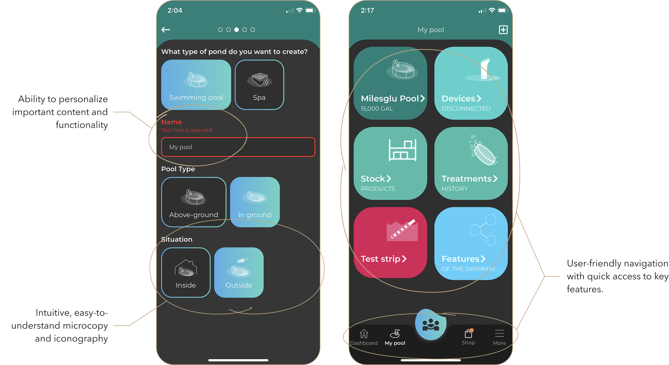
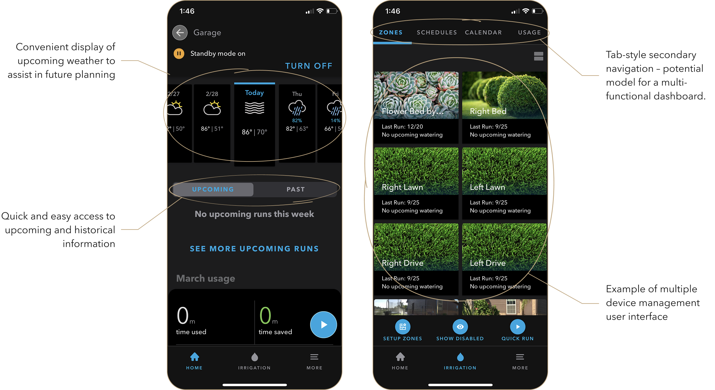
Conducting an in-depth competitive and comparative analysis of four direct and indirect competitors enabled us to identify prevailing industry standards, uncover gaps in the current user experience, and draw inspiration for new features in the Sutro mobile app redesign.
iopool and WaterGuru were selected as direct competitors due to their similar positioning in the smart water monitoring market, while Google Nest and Rachio were included as indirect competitors offering strong examples of IoT ecosystems with multi-device and zone management capabilities.



DATA ANALYSIS
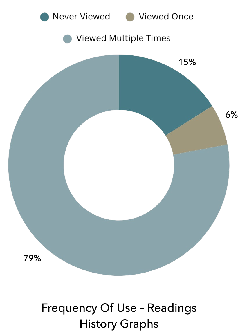
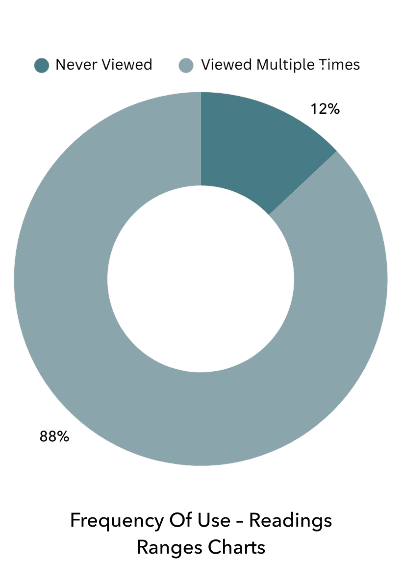
Analyzing backend user data played a critical role in informing the redesign. Specifically, I focused on understanding how frequently key features were being used in order to identify behavioral patterns and uncover opportunities to improve accessibility and usability.
On the main dashboard, this analysis centered on the Readings Range Charts – which help users interpret their test results across “good”, “caution”, and “bad” thresholds – and the Readings History Graphs, where usage insights could reveal how users monitor trends and make maintenance decisions over time.
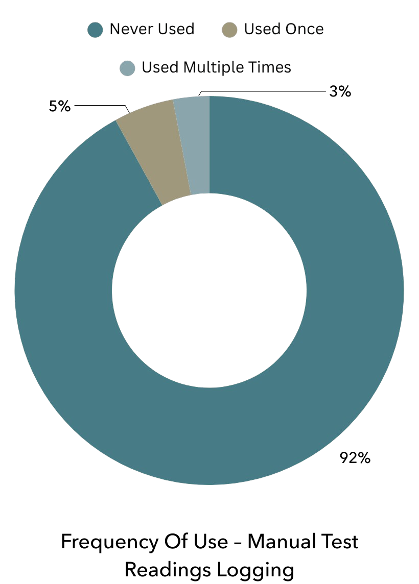
Next, I analyzed how frequently users followed Sutro’s Chemical Recommendations by marking alerts as completed subsequent to each test reading, providing insight into the feature’s overall usefulness and effectiveness. In addition, I reviewed engagement with the Manual Test Readings Logging feature to validate our assumption that it was underutilized due to poor visibility within the app.

USER INTERVIEWS
To better understand how real Sutro customers use and perceive the existing mobile app, I conducted in-depth one-on-one interviews with both satisfied users as well as those who had previously encountered issues within the past year. Out of dozens of outreach requests, 11 users responded, and ultimately, 7 were scheduled for 30-minute video interviews.



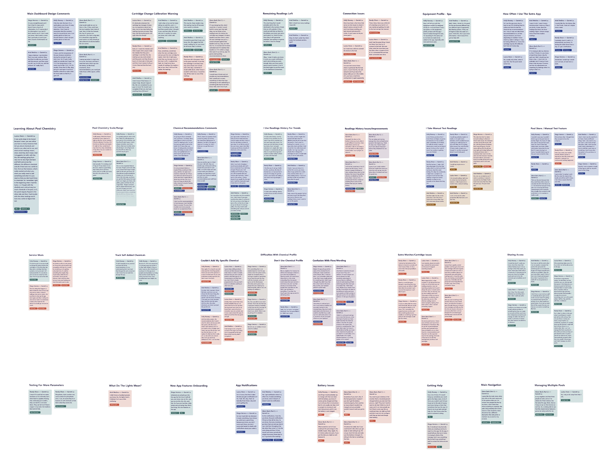
Upon completing a review of all the transcripts, I created an affinity map to organize major themes and extract key insights from the data. To view the affinity map in detail, please click the button below.
DATA SYNTHESIS

By analyzing the grouped responses across all user interviews, I identified major themes and recurring patterns in user behavior and sentiment. Data derived from this synthesis are summarized below.
The frequency of user mentions helped determine the relative urgency and prioritization of each finding. In addition, negative sentiment was used to assess the severity of usability issues or bugs, while positive feedback highlighted opportunities to enhance or expand well-received features. From the synthesized data above, we can derive the following key insights listed below.

Key Insights
Core dashboard features are valued but need greater context and accessibility:
Nearly all users rely on the dashboard details and readings history to track pool health, but they desire clearer explanations, better guidance, and simpler access to data.

Discoverability gaps lead to missed value in existing features:
All users regularly perform manual tests (whether at the pool store or using at-home test strips), yet remain unaware of the in-app data logging feature, highlighting a key discoverability issue.

Confusion persists around cartridge calibration and post-service readings:
Users understand that readings fluctuations can occur post-cartridge change, but lack guidance on how to respond, leading to confusion and reduced trust in Sutro’s recommendations.

Chemical profile experience has usability challenges and lacks clarity:
Low engagement with the chemical profile feature stems from complex setup and product scanning issues, indicating a need to re-examine the flow and improve user guidance.

Users seek more proactive and personalized insights:
Users want more proactive guidance – like nudges when readings near imbalance and additional dashboard features such as weather and test cartridge count to better plan for maintenance.

Ideate & Design
03
VISUAL IDENTITY
With several years of legacy design across hardware, web, mobile, and even printed assets – and a loyal customer base already familiar with the Sutro brand – we wanted to stay true to the existing style and visual identity with this redesign. At the same time, it was clear that the app’s UI had become dated and inconsistent, requiring a thoughtful refresh that would modernize the experience and fully compliment the reimagined user experience underneath.

STYLE GUIDE
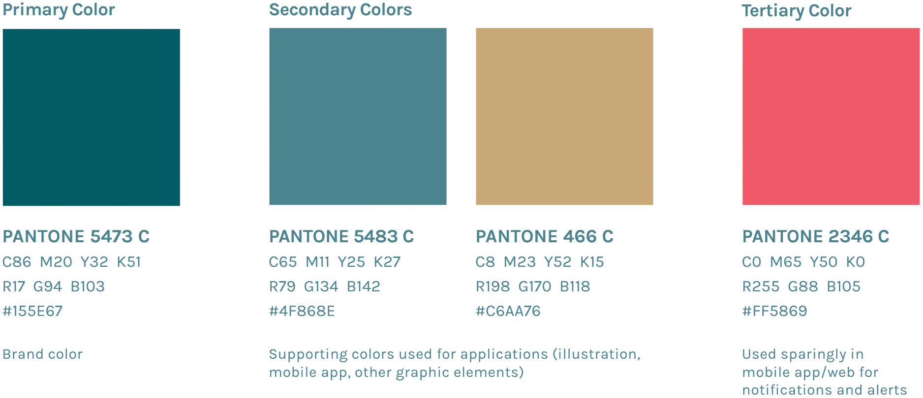
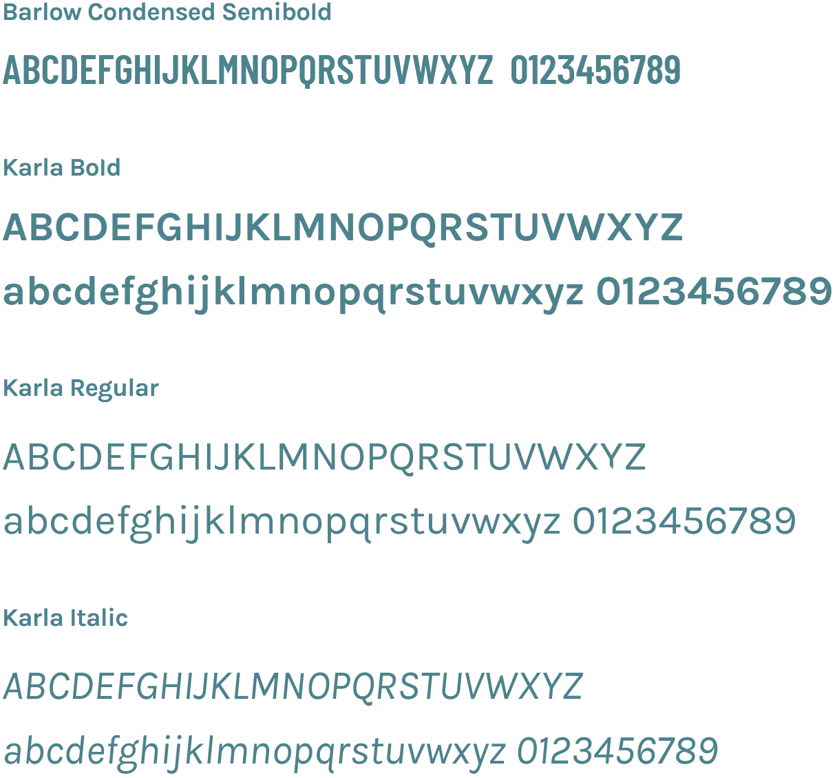
To preserve brand recognition, the redesign retained Sutro’s core color palette and typography. However, subtle UI refinements to interactive elements and layouts introduced modern design principles – enhancing consistency, usability, and visual harmony throughout the app.


INFORMATION ARCHITECTURE
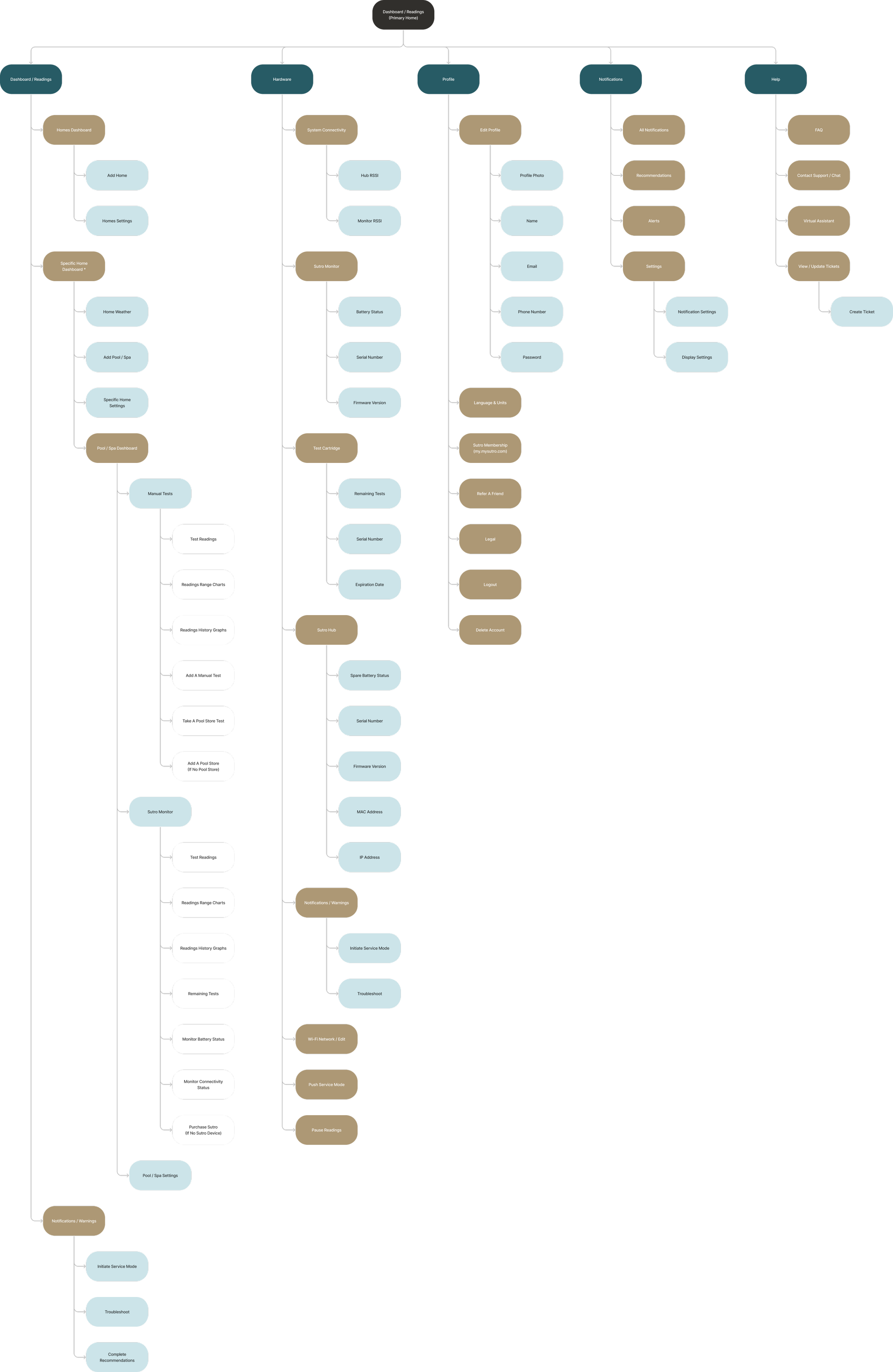
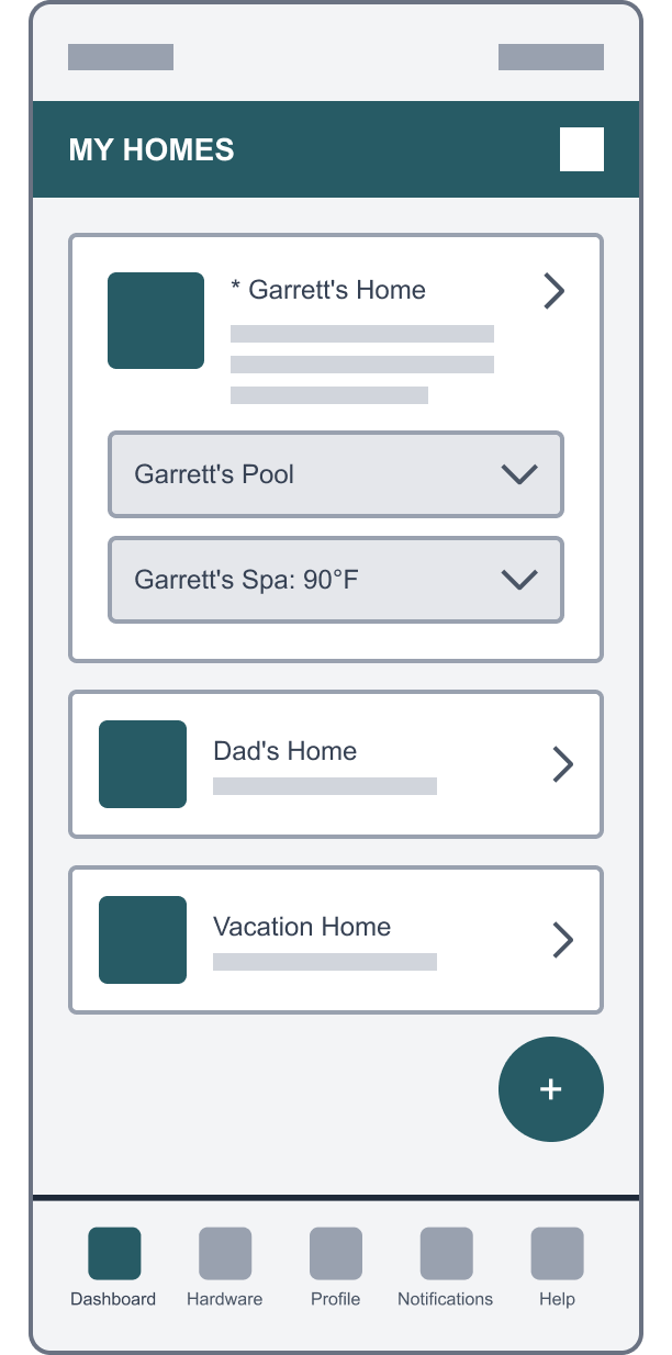
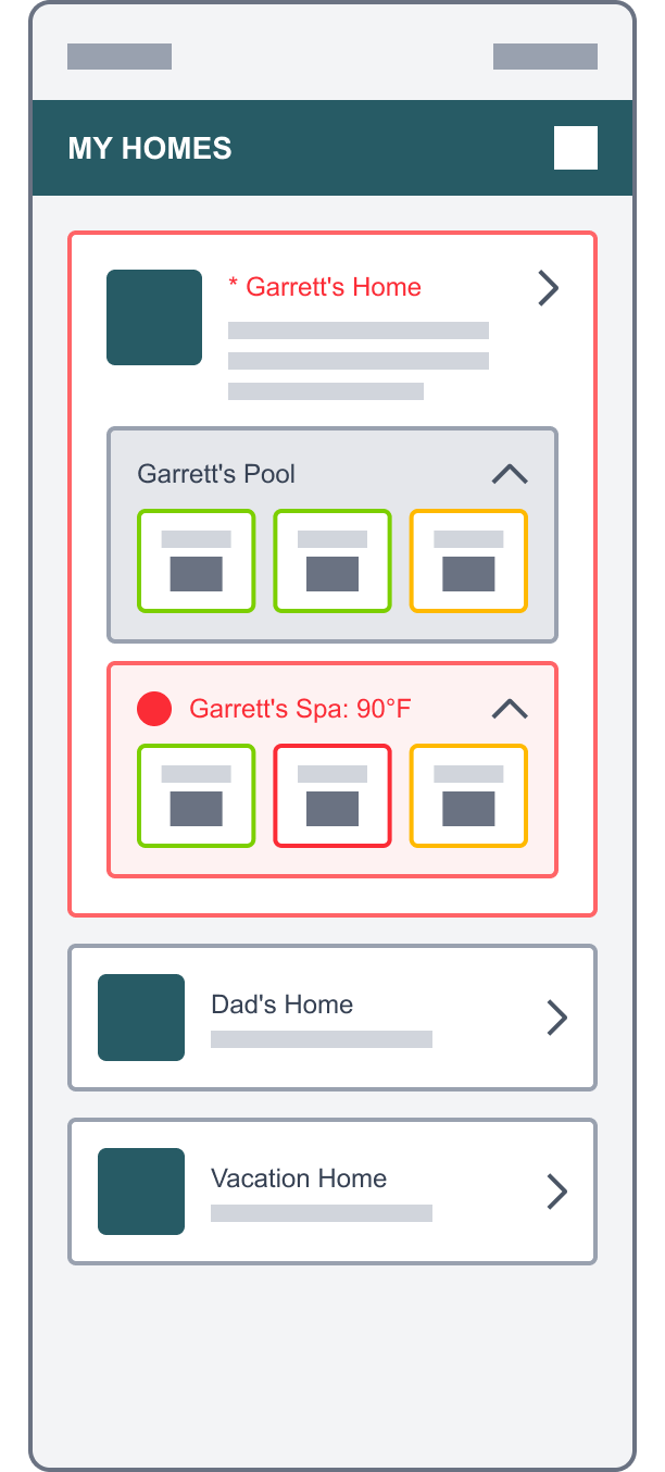
The first step in the redesign was to establish a clear information architecture for the new app. This was critical for organizing an increasingly complex system that included a three-tier hierarchical dashboard – from All Homes to Specific Home to Pool/Spa.
Within the Pool/Spa dashboard, I also needed to merge Sutro Monitor readings with manual test readings (furthermore, Manual Test readings included both at-home tests and pool store tests) into one cohesive, intuitive display. Mapping this hierarchy made it possible to clearly visualize how each layer of the experience would be interconnected and organized.
Next, I restructured the primary navigation menu to surface the five most frequently accessed sections within a single tap at the bottom of the app. Each section contained multiple feature sets, so thoughtful placement and association were key to maintaining clarity and minimizing cognitive load.
Lastly, I translated key research insights into specific features within the architecture map to ensure that the redesign directly addressed newly uncovered user needs and behaviors.
ONBOARDING FLOW
Next, I mapped out the new onboarding flows, introducing a home layer to both new and existing user profiles. This step was essential for establishing the backend data structures needed to support multiple homes and bodies of water, and it also informed the design of the introductory screens, a critical first touchpoint that set the tone for the new app experience (click to enlarge).
A new step was also introduced in the onboarding flow to let users select their primary pool store. This addition was key to aligning the Sutro mobile app with parent company Sani Marc’s in-store pool testing and customer management platform, laying the groundwork for future B2B integration (click to enlarge).
IDEATION & WIREFRAMING
Several collaborative sessions were held between design, product, engineering, and leadership to explore and align on design directions that addressed all of the above requirements. These ideation workshops included whiteboarding, rapid sketching, and open critique to refine concepts and eliminate those that didn’t meet stakeholder and user criteria.
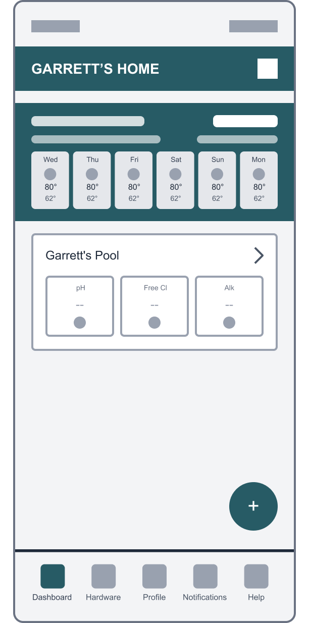
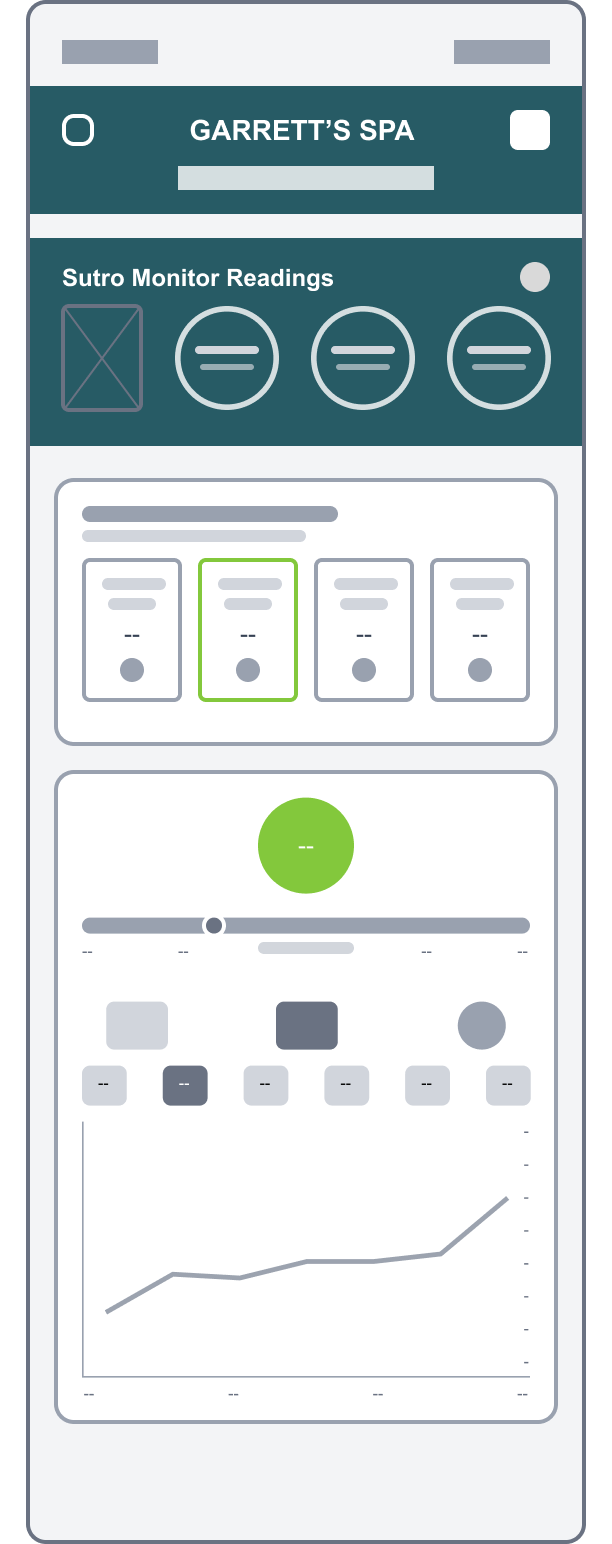
Once a concept direction was established, I proceeded to create low/mid-fidelity wireframes in Figma for final approval before continuing to high-fidelity mockups and delivery-ready designs. The examples wireframes below show various states of the new three-tier hierarchical dashboard.






A NEW NAVIGATION
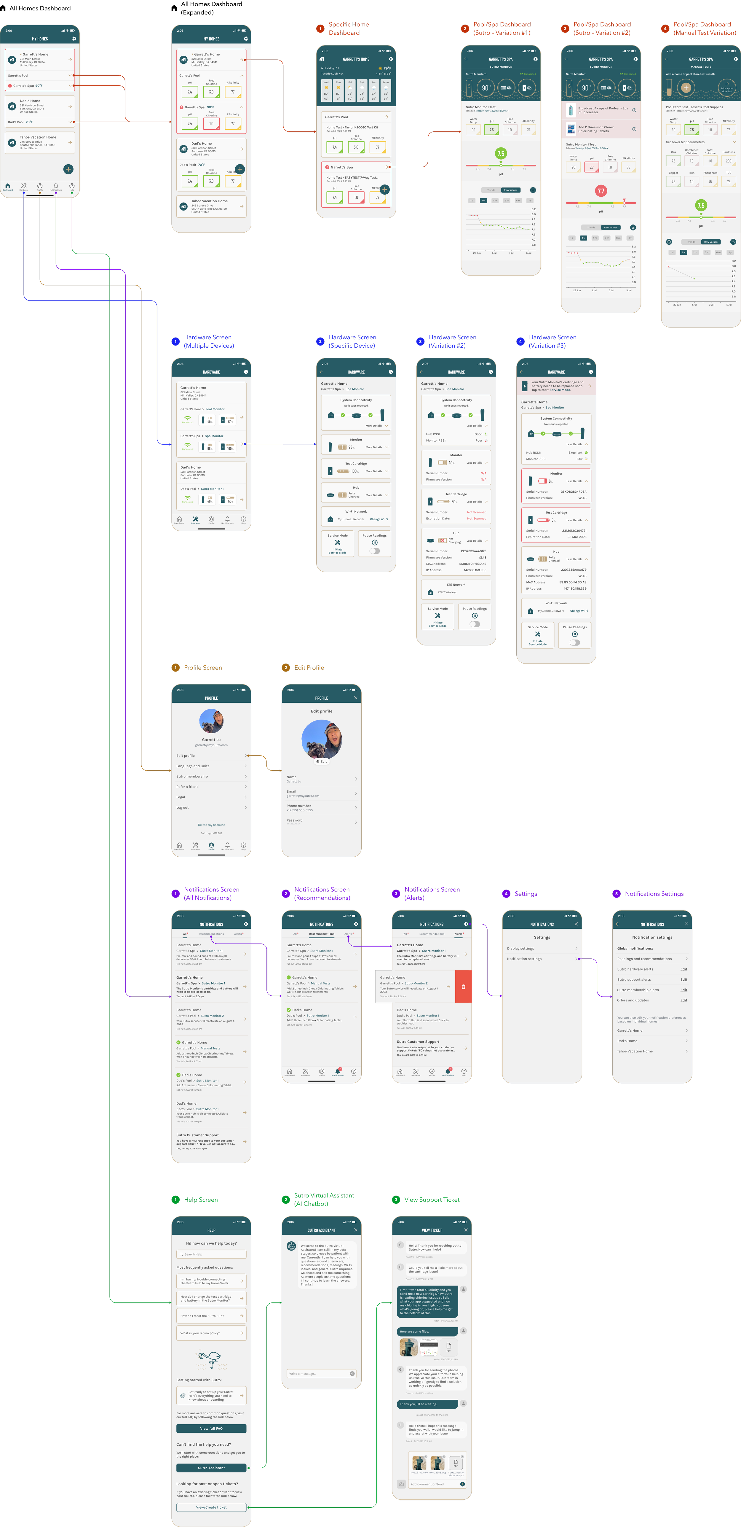
Building on the low/mid-fi wireframes, I developed detailed, high-fidelity mockups that defined the final look and behavior of the redesigned Sutro app. The most complex work involved restructuring the app’s navigation and reimagining core user flows, while other sections required only visual refinements to align with the new design language.
Due to the scope and complexity of the project, this phase spanned several months of intensive design work and the creation of hundreds of new high-fidelity screens. The diagram above provides a high-level overview of the reimagined information architecture and navigation that served as the basis of the new app experience. For a complete look at all the design screens, click here to open the Figma file.
POOL/SPA DASHBOARD
The Pool/Spa Dashboard required a deeper design exploration due to its unique criteria to merge Sutro Monitor readings with manual test results into a single, intuitive interface. Manual tests include both at-home readings as well as pool store tests – the latter helping to align the consumer app experience with Sani Marc’s in-store testing and customer management system for future B2B integration.
To accommodate multiple data sources within one cohesive view, I implemented a swipe-able card design that enabled users to seamlessly navigate between different readings. This modular approach also ensured scalability, allowing additional Sutro devices to be added to the dashboard in the future.
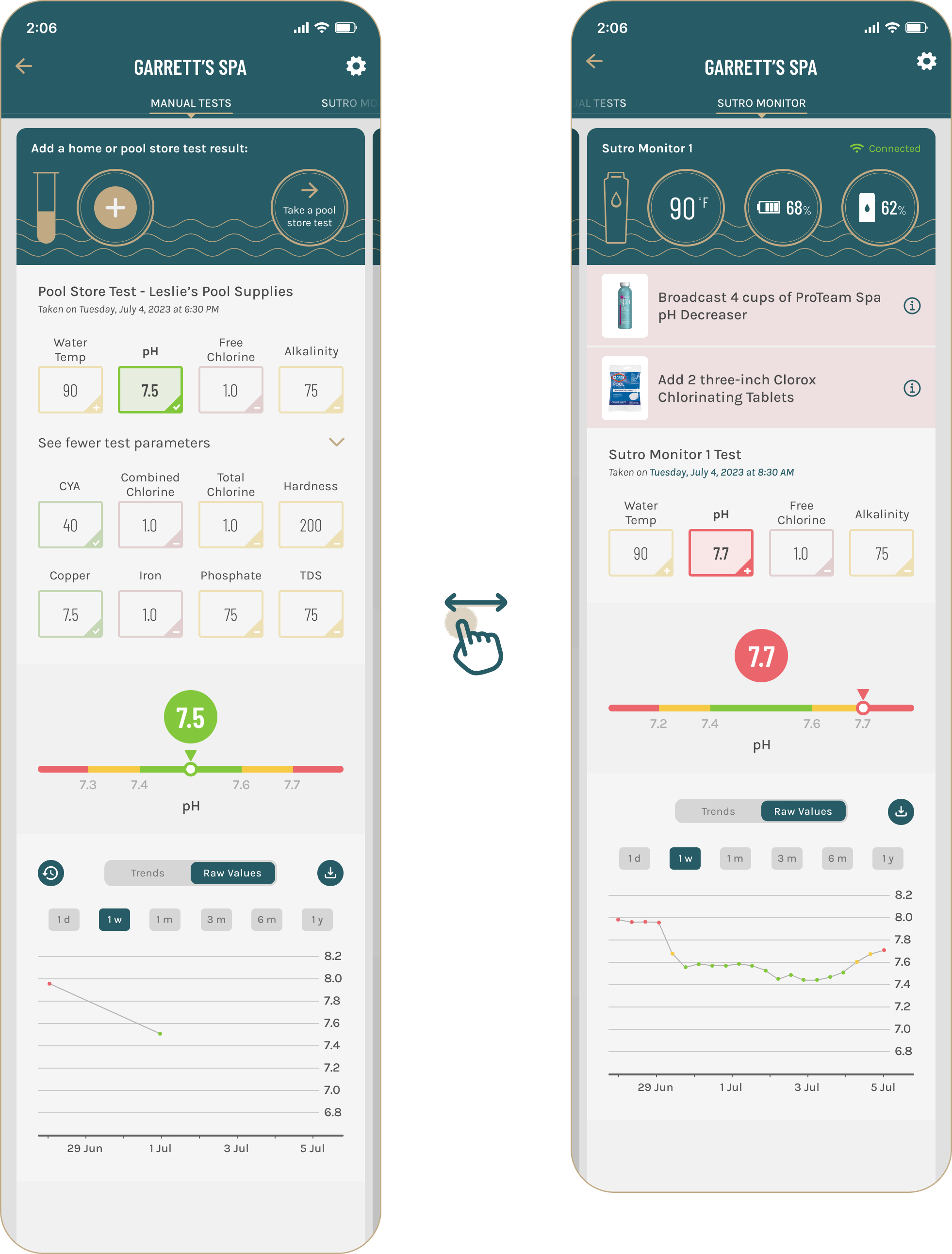
When users scroll down to view more details, the selected card expands to occupy the full width of the screen and temporarily disables horizontal swiping. I prototyped the horizontal swipe interaction (for navigating between cards) and the vertical scroll interaction (for exploring details within a single card), as demonstrated in the animation below.
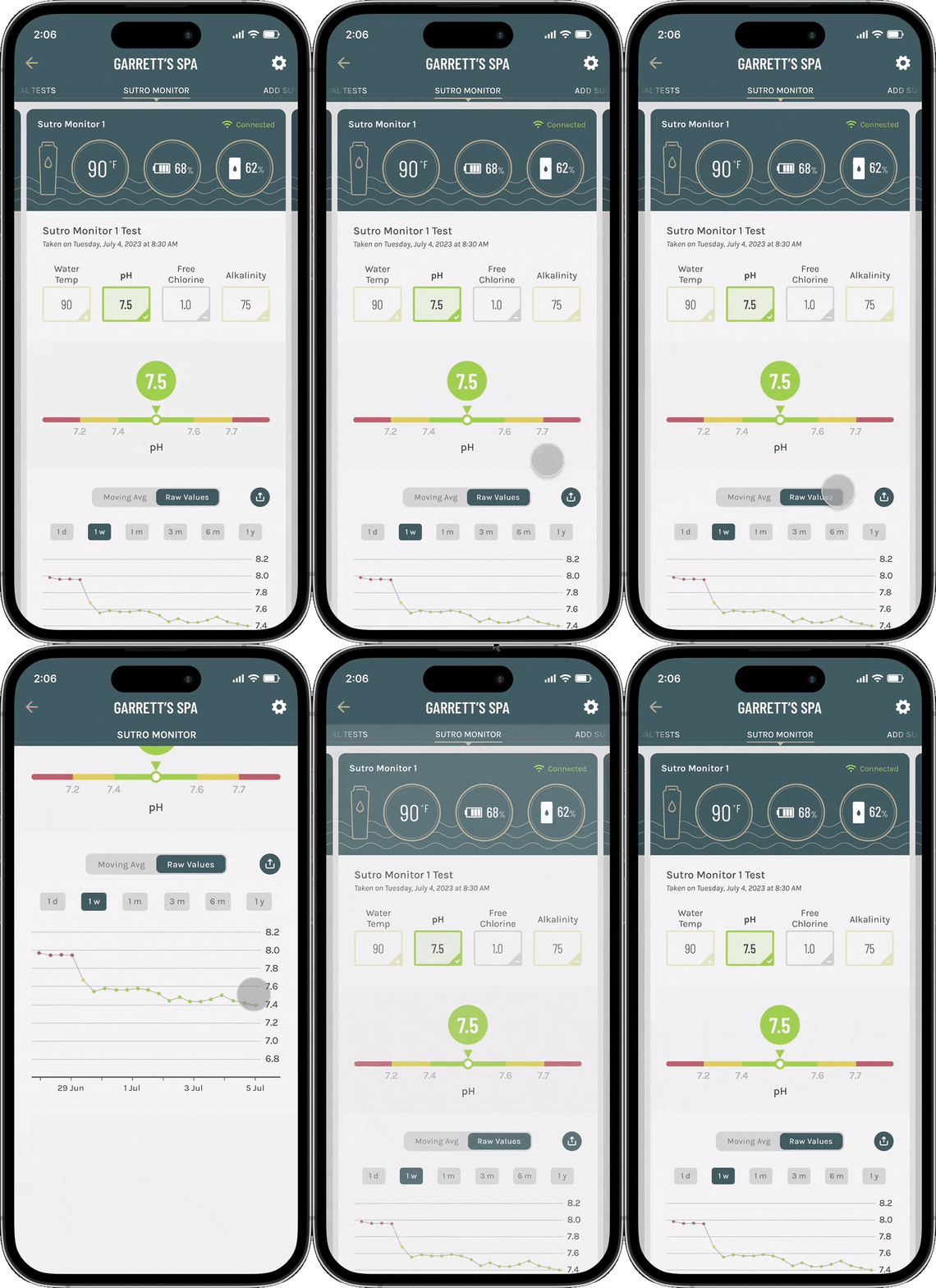
Furthermore, several important design improvements were made to the Pool/Spa Dashboard based on key insights gathered during the research phase:

HOME DASHBOARD
The new Specific Home Dashboard gives users a clear, at-a-glance view of the latest test readings for all pools and spas at their home. It is designed for users who want a quick status update without diving into detailed insights. A multi-day weather forecast is featured at the top, helping users plan for pool or spa use and prepare for any weather-related maintenance needs in advance.
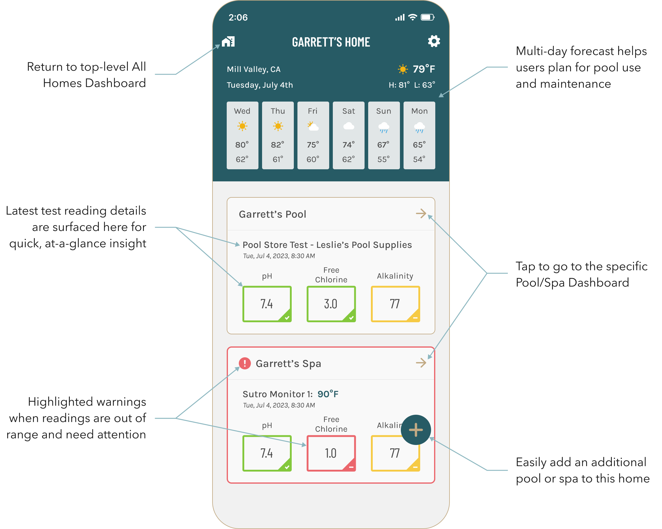

Streamlined navigation and dashboard management across all properties and pools.
The redesigned navigation prioritizes efficiency and clarity, placing essential features within immediate reach, while the new dashboard unifies a complex hierarchy order of homes, pools, and devices into one cohesive, scalable system – enabling customers to monitor and manage all of their setups with ease.
HARDWARE SERVICE FLOWS
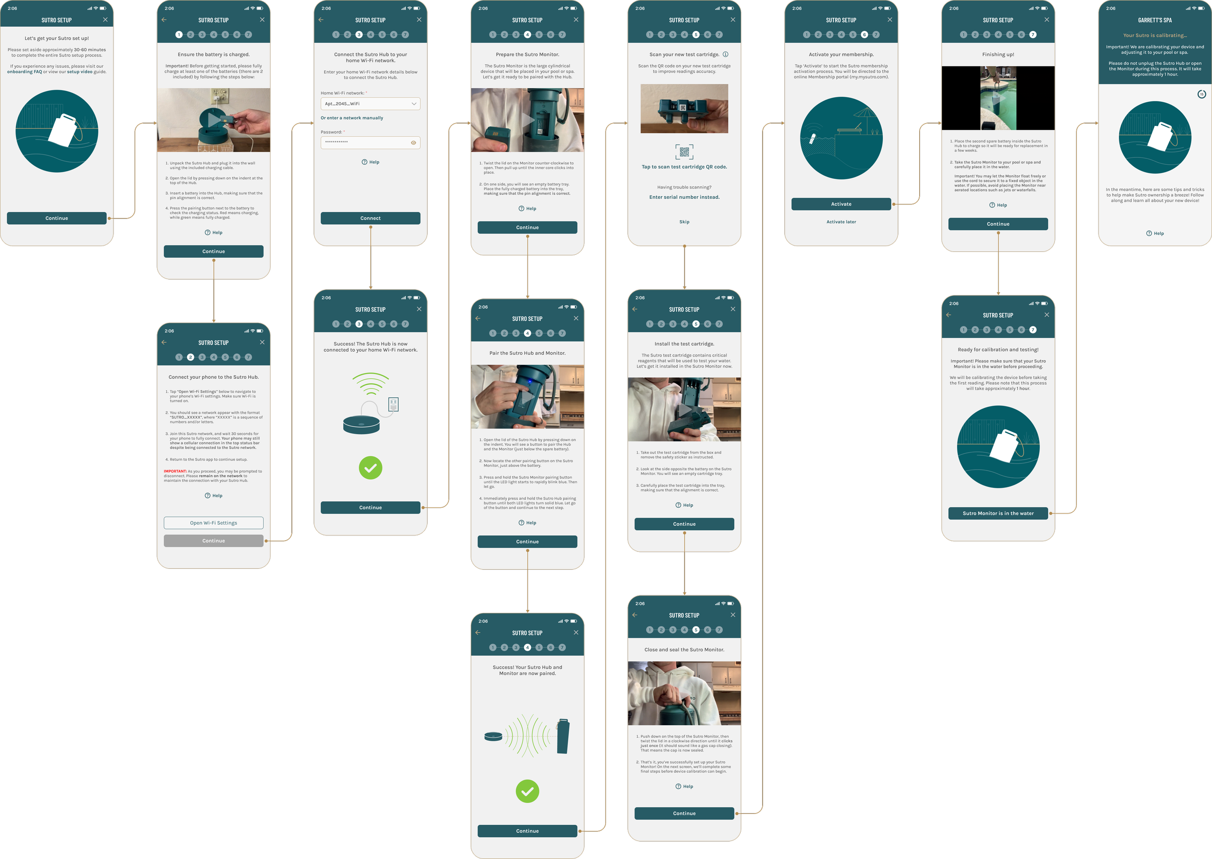
During the research phase, users shared that the hardware onboarding and Service Mode flows felt disconnected from real-world scenarios and offered little help when things went wrong. To resolve this, I redesigned the experience to be more context-driven and supportive, introducing shorter, step-by-step instructions, quick videos demonstrating key actions, and easier access to troubleshooting and customer support.
HELPFUL REMINDERS
A recurring theme from the research phase was user confusion around readings fluctuations following Service Mode. While some users understood that replacing a test cartridge automatically triggers a 24 - 48 hour calibration period, most were unsure whether to follow chemical recommendations during that time. To address this, I introduced contextual warning messages at critical steps in the app to set clear expectations, minimize uncertainty, and strengthen trust in Sutro’s test readings.

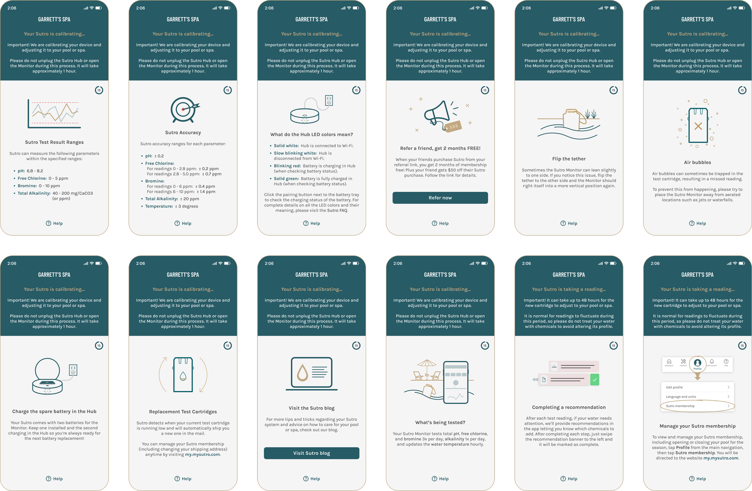
To reduce support inquiries and help users better understand their Sutro system, I introduced a carousel of helpful tips, to be displayed during the post-Service Mode calibration period. Each tip appears for 15 seconds, offering quick, educational insights to engage users and preempt frequently asked questions.
CHEMICAL PROFILE FLOW
User feedback revealed a common frustration with the Chemical Profile onboarding flow, primarily due to repeated errors when scanning their chemical products. The feature was designed to recognize a customer’s actual products and use that data to generate personalized treatment recommendations – however, many products were missing from our database, resulting in failed scans and user drop-off.
To address this issue, I implemented several improvements: expanding the backend product database, better surfacing the ability to select generic chemical types when exact products aren’t recognized, and introducing a product submission feature so users can easily add their own brands to the Sutro database along with photos. These updates guided the redesign of the new Chemical Profile onboarding flow shown below.

Additionally, to streamline the onboarding process and reduce drop-off rates, I introduced a feature that allowed users to copy an existing Chemical Profile to new pools or spas – ideal for those using the same products across multiple setups.

Lastly, I incorporated contextual info buttons explaining key pool chemistry terms, helping new pool and spa owners better understand the meaning and purpose of each chemical type.
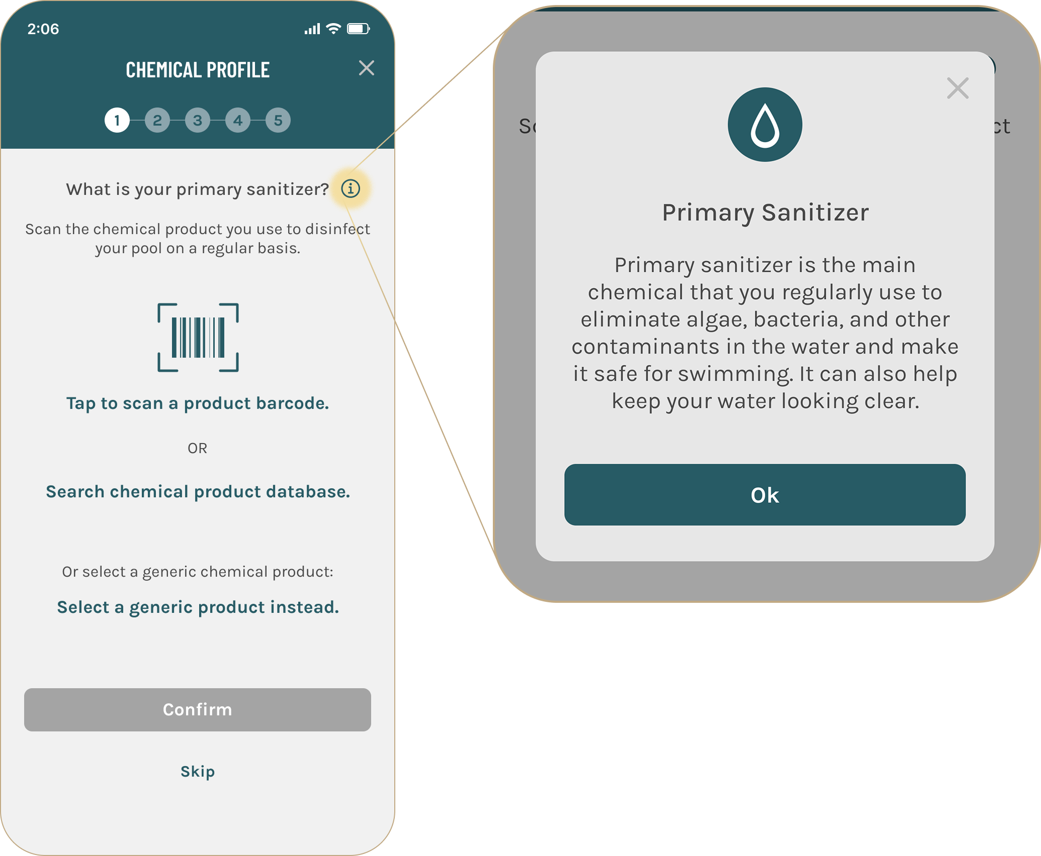

Smarter, intuitive user flows that simplify decisions and strengthen confidence.
The redesigned onboarding and chemical profile flows simplify complex tasks with clear, step-by-step guidance and contextual information. Enhancements like seamless chemical product selection, educational tips, and quick-access troubleshooting minimize confusion and strengthen user confidence.
HI-FI PROTOTYPE
Please try out the hi-fidelity prototype below – covering Home setup, Dashboard exploration, and parts of the new onboarding (pool profile and chemical profile flows). Please note that this example covers the specific use case where an existing Sutro customer starts the new mobile app for the first time. Lastly, be advised that not all flows and features have been prototyped and button functionality is limited to core tasks.
Testing & Validation
04
USABILITY TESTING
With the redesigned dashboard and onboarding flows prototyped, I conducted a Maze-based usability study with seven existing Sutro users – ranging from long-time members to newer adopters. The primary objective was to confirm that users could confidently set up their primary home, add additional properties, and understand the new dashboard structure without friction.
I also evaluated how easily participants could add a new pool or spa within a home and navigate the updated pool and chemical profile flows. Key findings are summarized below:
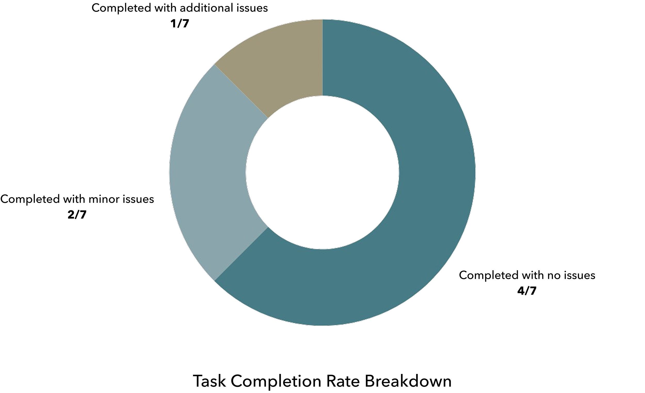
All participants successfully completed the end-to-end task flow (sign-in, add home, pool setup, and chemical profile flow), resulting in a 100% completion rate. Two users made a few extra exploratory taps before advancing at various points, and one participant attempted to access unprototyped sections despite clear instructions. Given the context, I treated the last case as an outlier.

We also evaluated which dashboard view users preferred as their default. While the prototype defaulted to All Homes, most participants found it more preferable to start on a Specific Home or Pool/Spa Dashboard, reflecting how they actually use the app day to day. Given that most users oversee only one or two pools at a single property, this feedback made the intended dashboard logic clear.
DASHBOARD DEFAULTS
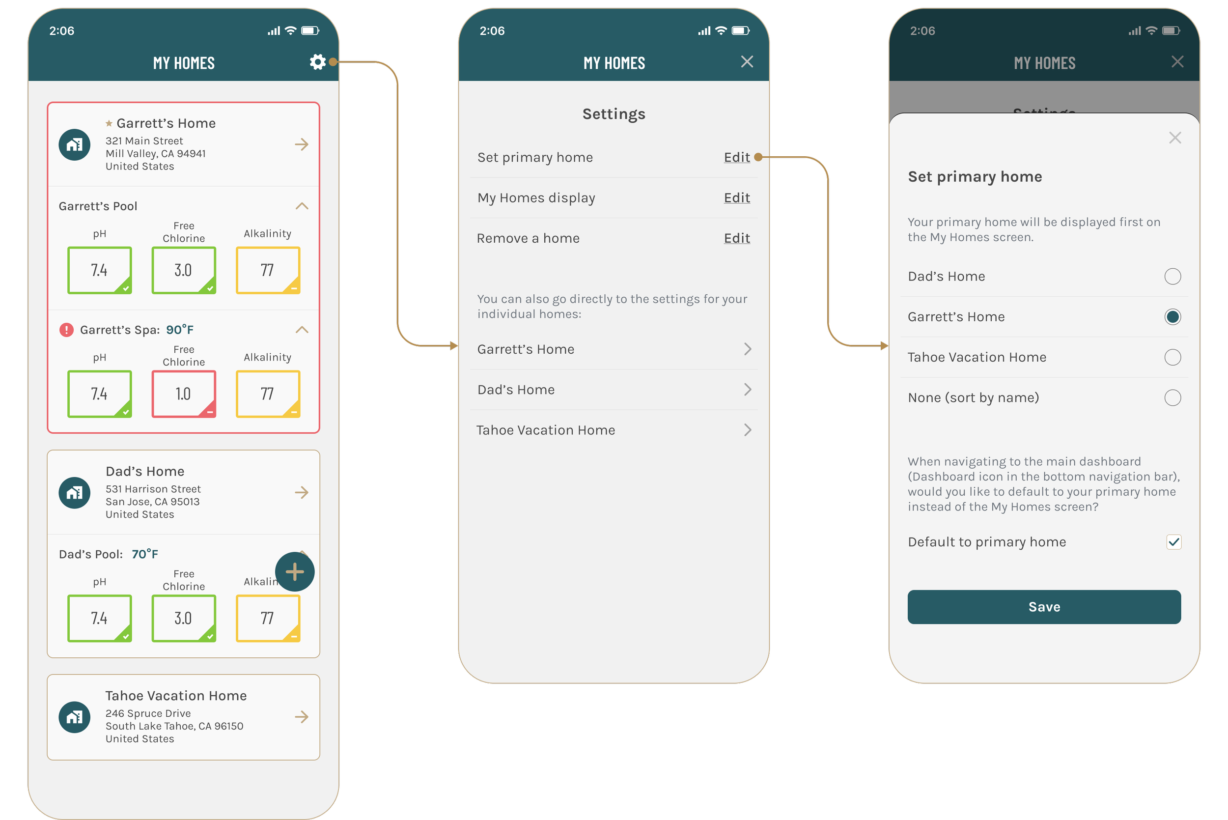
Users with multiple homes can now designate a Primary Home, which becomes their default dashboard. For single-home profiles, the app defaults to the Pool/Spa Dashboard when there is only one body of water, or the Specific Home Dashboard when there are two or more – ensuring an efficient, context-aligned starting point to the Sutro app.
MEASURABLE OUTCOMES
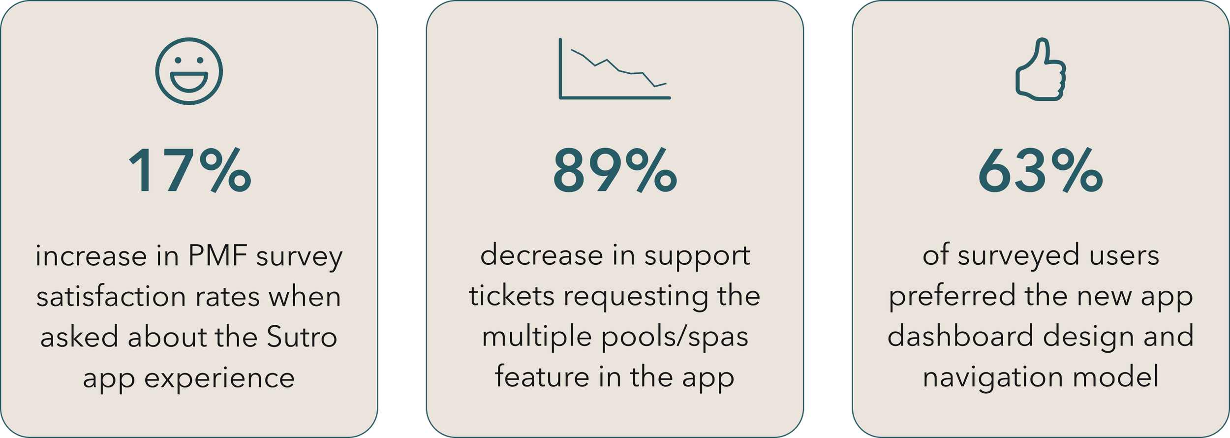
Although not all features of the redesigned app are live yet, the new Multiple Homes/Pools dashboard design and navigation architecture have already launched. Meanwhile, the updated onboarding flows are currently in planning with engineering. Early feedback from customer support shows clear, measurable impact. Key results include:
Next Steps
05
NEXT STEPS
While all of the app redesign work is fully finalized, much of the features are still awaiting development. The next phase centers on collaborating with Product and Engineering to prioritize sprints and epics and release the remaining work. Further down the roadmap, we plan to align the Sutro mobile app with Sutro Central and my.mySutro to create a wholly cohesive ecosystem.

